
Swiss / International Style (1940s–1980s): The Foundation of Modern Graphic Design
- Dec 14, 2025
- 3 min read
Among all graphic design movements, Swiss Style — also known as the International Typographic Style — stands as one of the most influential and enduring. Emerging in the 1940s and dominating visual communication until the late 1980s, this design approach reshaped how information is structured, perceived, and understood.
Built on clarity, objectivity, grid systems, and typography, Swiss Style moved graphic design away from decoration and emotion toward function, precision, and universal communication. Today, its principles remain deeply embedded in branding, editorial design, UI/UX, and corporate identity systems.
In this article, we explore the origins, core principles, iconic designers, and lasting impact of Swiss / International Style in graphic design.

What Is Swiss / International Style?
Swiss Style is a modernist graphic design movement focused on clear visual communication. Its primary goal is not self-expression, but the accurate and efficient transmission of information.
Instead of ornamentation, it relies on:
logical structure
mathematical layouts
neutral typography
minimal visual language
The term “International” reflects the movement’s ambition to create a universal design language — one that transcends culture, language, and geography.
Historical Background: How Swiss Style Emerged
Swiss Style developed after World War II, primarily in Switzerland and Germany, where designers sought a rational, objective approach to communication. Influenced by Bauhaus, Constructivism, and De Stijl, Swiss designers refined modernism into a disciplined, systematic method.
Key institutions and figures played a crucial role in shaping the movement:
Basel School of Design
Zurich School of Arts and Crafts
Josef Müller-Brockmann
Armin Hofmann
Max Bill
Emil Ruder
Their teaching methods and theoretical writings helped formalize Swiss Style as a design system rather than a decorative trend.
Core Principles of Swiss / International Style
1. Grid Systems: Structure Above All
The grid is the backbone of Swiss Style. Designers divide the layout into consistent vertical and horizontal units, ensuring order and balance.
Why grids matter:
create visual consistency
improve readability
establish hierarchy
simplify complex information
Josef Müller-Brockmann’s book “Grid Systems in Graphic Design” remains a cornerstone of modern design education.
2. Typography as the Primary Design Element
Swiss Style treats typography not as decoration, but as the main carrier of meaning. Designers favor:
sans-serif typefaces
clean letterforms
consistent font families
Helvetica and Swiss Typography
Designed in 1957 by Max Miedinger, Helvetica became the defining typeface of the movement. Its neutrality, legibility, and versatility perfectly embody Swiss design philosophy.
3. Asymmetrical Layouts
Rather than centered symmetry, Swiss Style embraces asymmetry balanced through grid alignment. This creates:
dynamic visual flow
modern composition
natural reading direction
Asymmetry adds movement without sacrificing order.
4. Minimalism and Functional Design
Every element must serve a purpose. If it does not communicate information, it is removed.
Swiss Style avoids:
decorative textures
unnecessary colors
visual noise
emotional illustration
The result is a timeless, clean, and professional aesthetic.
5. Photography Over Illustration
Instead of expressive illustration, Swiss designers prefer objective photography. Photography is used as:
factual documentation
visual evidence
neutral storytelling tool
This reinforces the movement’s commitment to truth and clarity.


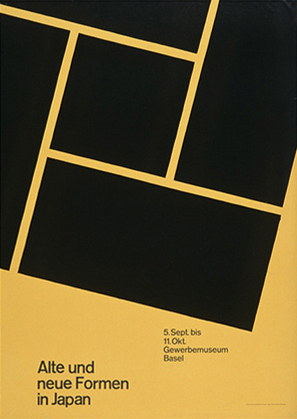


Iconic Swiss Style Examples
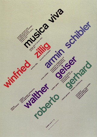
Josef Müller-Brockmann – Concert Posters
His Zurich Tonhalle concert posters are classic examples of Swiss Style:
bold grids
minimal color palettes
typographic hierarchy
precise alignment
These posters remain benchmarks for modern poster design.
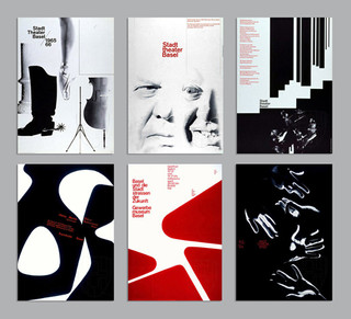
Armin Hofmann – Educational Graphic Design
Hofmann’s work for Basel School of Design emphasizes:
black-and-white contrast
expressive typography
disciplined composition
His teaching shaped generations of designers worldwide.
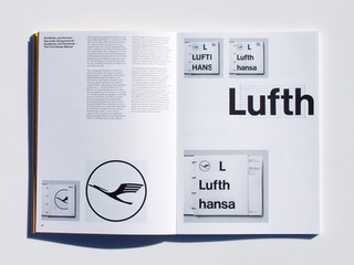
Corporate Identity and Wayfinding Systems
Swiss Style heavily influenced global branding and signage systems, including:
Lufthansa corporate identity (Otl Aicher)
IBM branding (Paul Rand, Swiss-influenced)
airport signage systems
public transportation maps
These systems prioritize clarity, legibility, and consistency.
Modern Web and UI/UX Design
Today’s digital interfaces rely heavily on Swiss principles:
grid-based layouts
minimal UI components
typographic hierarchy
clean navigation
Modern UX design is, in many ways, a direct evolution of Swiss Style.
The Lasting Impact of Swiss Style
Swiss / International Style remains relevant because it is timeless. It adapts effortlessly to new media, technologies, and platforms while maintaining its core values.
Its influence can be seen in:
branding and logo design
editorial layouts
web and mobile interfaces
corporate communication
information design
Swiss Style transformed graphic design into a professional, systematic discipline — not just an art form.
Swiss / International Style is more than a historical movement; it is the foundation of modern graphic design thinking. By prioritizing clarity, structure, and objectivity, it established principles that continue to guide designers today.
In a world overloaded with visual noise, Swiss Style reminds us that simplicity is not emptiness — it is precision.


